
Honoring and protecting Italy's greatest treasure: its elderly
Italy, until recently, was the country hardest hit by Covid-19. Its losses have been huge, but the group most tragically diminished by the virus, here, has been the elderly. In many cases, those that didn’t survive Coronavirus had survived World War II. They knew about hardship.
For all Italians, this loss is tantamount to losing a living link to the traditions that you live every day. And for a pasta company that prides itself on upholding the culinary code of those traditions, it’s a cause you have to fight for. The best way— the only way right now— to protect them is to remain on lockdown, even as we see some improvements. Thus was born the campaign, #aCasaPerLoro (Stay Home for Them).
“For showing us the value of what matters most... for listening instead of lecturing... for teaching us how much salt to throw in the pot and when to tear up the recipes... for living through hardships we can’t imagine with the strength to keep looking forward... for being our best example in times like these, we can only say, “Thank you.” And we ask everyone to stay at home to keep you safe.”

This campaign was pulled together in little over a week with the generous collaboration and contribution of the Rummo family, editor Vilma Conte, director Roberto Badò who supervised production and shot the original brand material which provided much of the footage used here, D.P. Alessio Viola and his daughters who contributed from home, executive producer Emiliano Merzagora of Altamarea Films and his daughter and father who also contributed from home, Nicoletta Gatti and her mother Adriana Badò who contributed from home, and Flavio Ibba for the music. Much gratitude also to PopEye Studio for the beautiful work on social media. THANK YOU, everyone!
Pasta Rummo has also contributed ventilators, iPads, many tons of pasta and financial support during this time of crisis. I am so proud and pleased to work with them. You can follow their Instagram and Facebook pages for more information.
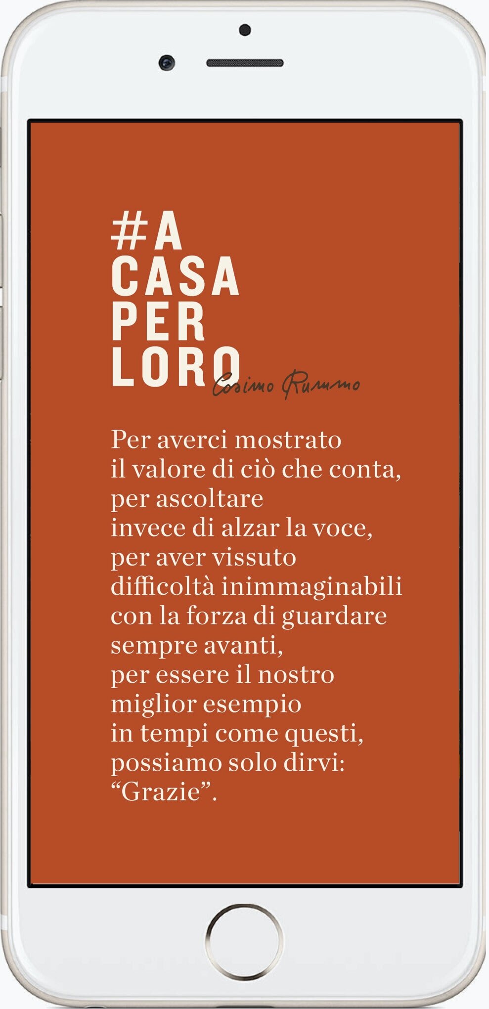


Social media in collaboration with PopEye Studio.


Social media in collaboration with PopEye Studio.